These are CAD concepts, resolved to manufacturing intent rather than to a prototype — mechanism, tolerances, service access, and in two cases a full electrical specification These aren't a matched set. Homes aren't matched sets — things coexist rather than coordinate, and a suite that matches perfectly belongs in a showroom. What's shared here is the reasoning, not the finish. Every object has a window. Glass door, open typebar throat, drive bay — or in the remote's case, the entire body. An object made to be seen has nothing to hide inside either. No screens. Every input is physical. Fasteners visible, service access designed.** These are meant to be kept, which means they're meant to be opened. A cool body, one saturated accent, one metal. Palette caption: Slate, warm grey, blue, clear. Four bodies, four accents.
TOOLS
SolidWorks
Rhino
Fusion 360
Keyshot
Runchat
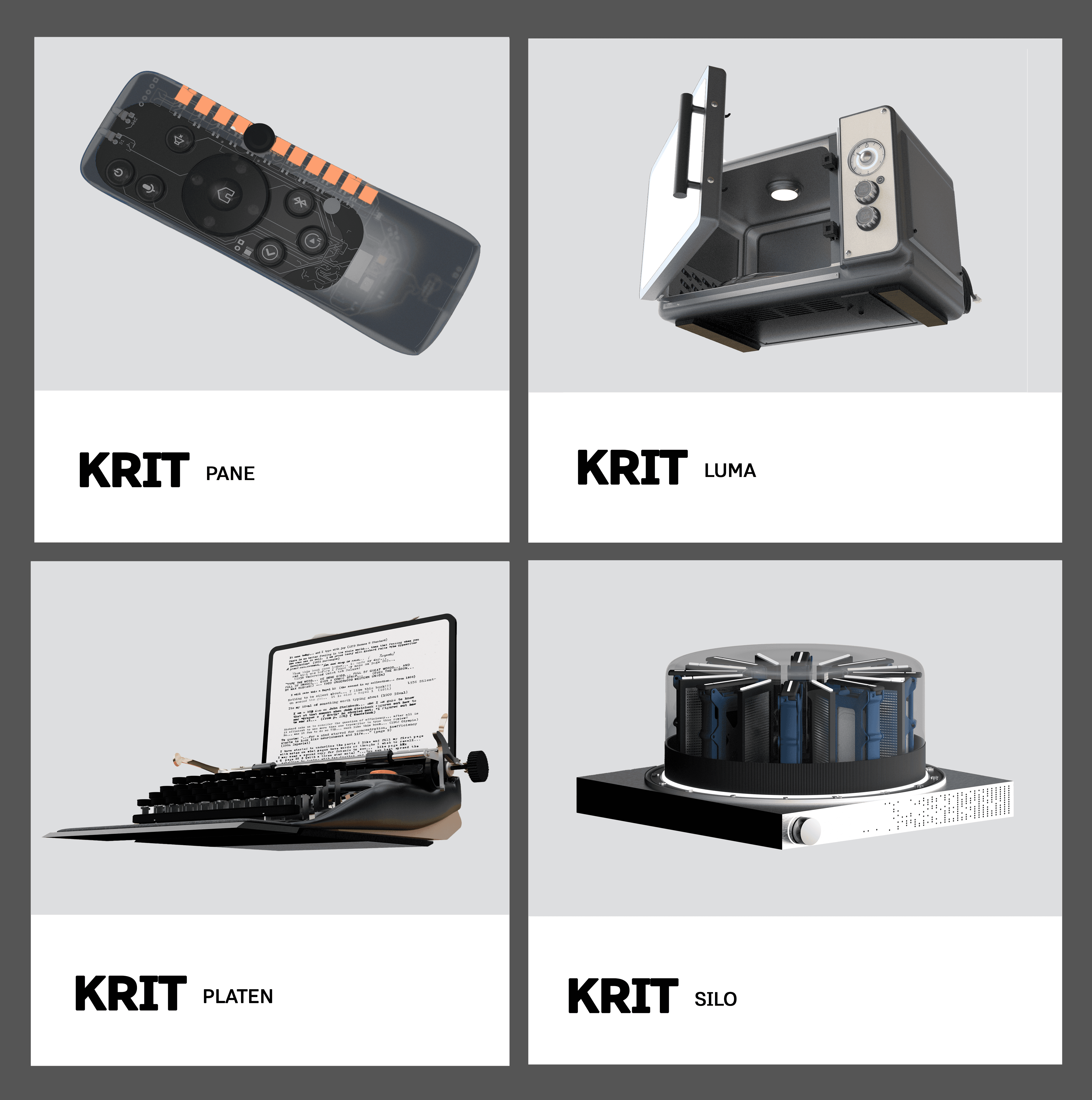
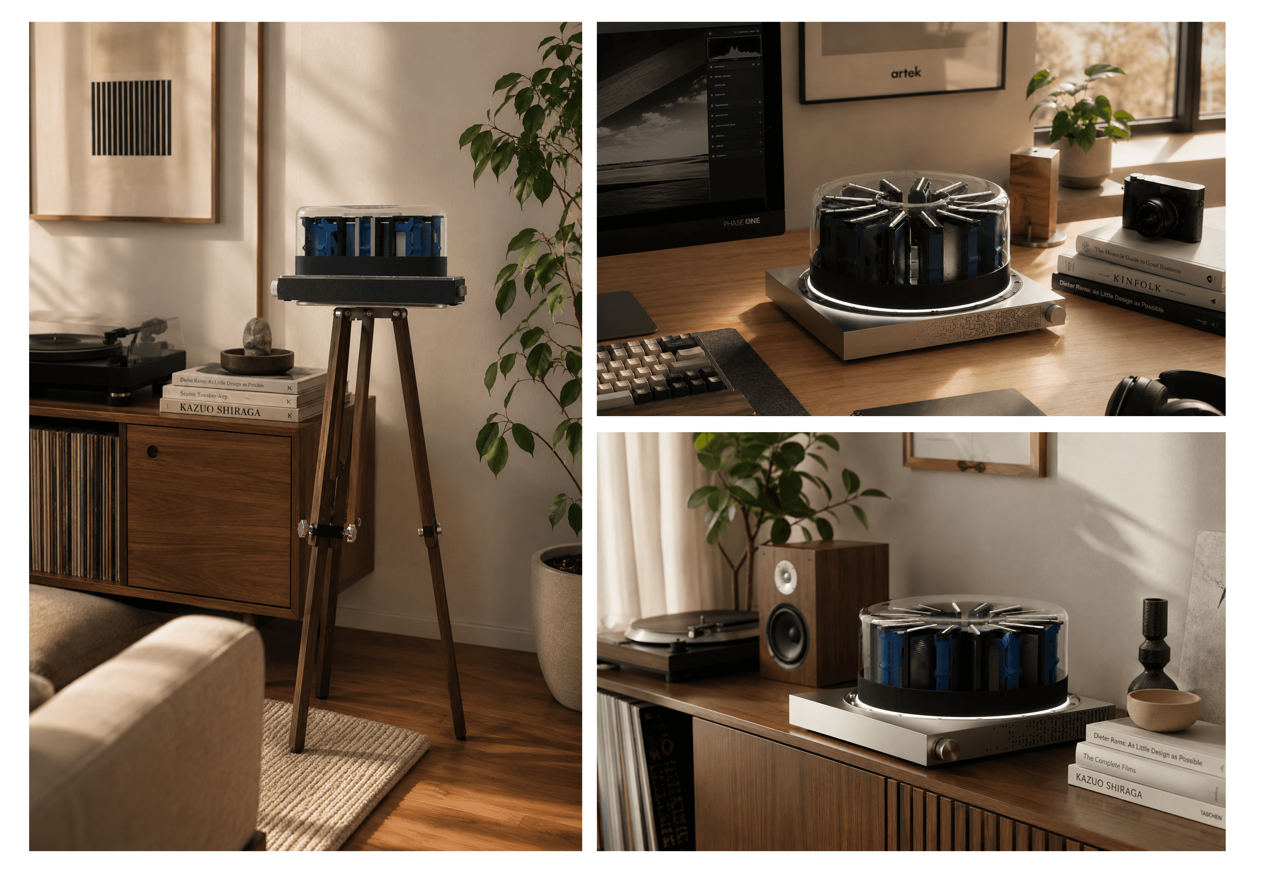
Brief: The one you forget until it fails. Why it exists — This is where your photographs live, and it sits in a closet. You don't think about it once until a drive fails and you find out what was on it. Why it's built this way — A window over the drive bay, an activity light readable across a room, a drive swap you can do by hand and a nod to old school rolodex projectors. Why it's better — You maintain what you can see. Making the machine's state visible is a maintenance feature and a decorative one



Brief: The keyboard you put away when you're done. Why it exists — A keyboard gives you no reason to leave it out, so it goes in a drawer. And a tablet propped on a stand is a worse object than either half. Why it's built this way — The levers are real, not cosmetic. That decision broke the electronics before it fixed anything: a 2:1 lever gives ten millimeters of travel at the cap but five at the switch, and a mechanical switch only has four. So there are no switches — each lever carries a magnet, and a Hall sensor reads it from below. Why it's better — The levers and their springs own all of the feel, so it's tuned mechanically instead of bought off a switch catalogue. Nothing in the key action wears out.


Brief: The appliance you hide behind a cabinet door. Why it exists — Microwave interfaces are the textbook case of feature creep: twenty-two buttons, three of them worn. And the part that kills the appliance isn't the magnetron, it's the keypad, which delaminates and takes a working machine to landfill with a decade left in it. Why it's built this way — A dial, two buttons, no clock, no membrane. The dial is an encoder driving electronic timing rather than a wind-down spring. Why it's better — Fewer failure modes. Operable without reading anything, which matters for anyone with low vision or arthritis.


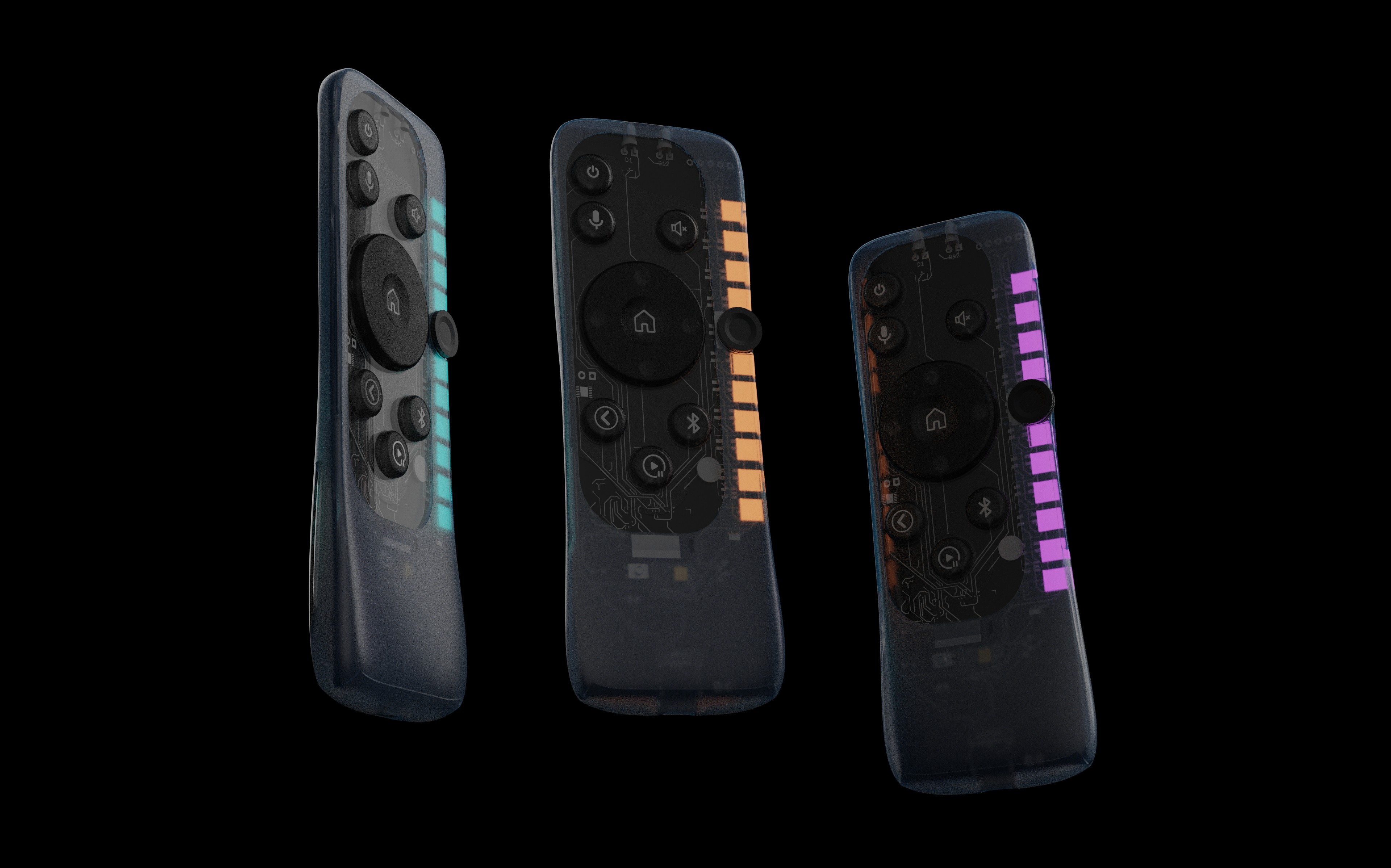
Brief: The one you lose in the sofa. Why it exists — A remote has no place to sit, so it doesn't have one. The first version of this was transparent, but the internals were designed like internals: loose wires across the one window anyone would look through. Why it's built this way — Two interconnects in the entire product. Black solder mask, silkscreen treated as typography, ugly components deliberately placed under the opaque key mask. Why it's better — Reachable at any grip height, and usable without looking. Eleven buttons, no menus. And the inside survives being looked at.


Each one of these is my take on what modern manufacturable tech design should be - K